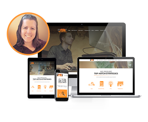
What Makes Up a Website?
A basic website is created using two types of languages: Hypertext Markup Language (HTML), which builds the structure of the site and Cascading Style Sheets (CSS), which styles the site. As technology progresses, the capabilities of these languages increases, which lets us build bigger and more aesthetically pleasing websites.
The History of Websites
It wasn’t too long ago that a website was built using a fixed width and was only viewed on a desktop or laptop computer. It was coded with basic HTML, and the content was often presented using a form element. The homepages were short with not a lot of content, and you didn’t have to worry about how it looked on any other device. Mobile phones eventually became more prevalent, and it became common for companies to have a standard desktop website and a separate website for mobile phones. While this made sense at the time, its disadvantages definitely outweigh the advantages, and from this responsive web design was born.
Benefits of Responsive Web Design
- Maintenance
The maintenance is much easier since you only have to update your code and content in one spot and no longer have to wonder if both sites have the same content. - User Experience
The user experience is elevated because the content you’re viewing on whatever device you’re using is designed to look good and be readable. When users are more engaged, conversion rates increase. - SEO Rankings
Responsive web design improves SEO rankings. Since much of today’s website traffic comes through mobile devices, Google has switched to placing a higher weight on mobile-friendly sites. Not having content on two sites also decreases duplicate content issues.
Responsive Web Design Components
Making a website be responsive involves four main steps. Adding a meta viewport tag, using a flexible grid, making sure images are fluid, and using media queries. Once these for steps are mastered, any site can be made responsive!
Add a Meta Viewport Tag
The default viewport width is around 980 pixels wide, which is generally fine for viewing a website on desktop, but when you view a site on mobile, the site gets zoomed out until the whole site can be viewed at once. On a small device, this makes the content incredibly difficult to see because what is large on a desktop ends up super small on a mobile phone. To fix this, add the code <meta name=”viewport” content=”width=device-width, initial-scale=1″> to the <head> tag in the header file. This makes it so the width of the website is the width of the device you’re using, and this prevents the browser window from being zoomed out, allowing the content to be readable.
Use a Flexible Grid in Your HTML Code
The old way to code involved using fixed values because it only needed to look good at one size. The trend nowadays is to use percentages and relative units of measurements that automatically adjust depending on the width of your viewport.
Here are a few of the more popular options:
- Make Your Own Grid
This is more labor intensive, but it’s a good option when you want complete control and don’t want to fill your files with extra, unnecessary code. - Use CSS Framework
These are commonly used because they let you easily set up a grid and use other classes to automatically add predefined styles. It tends to bloat your code, but it allows you to develop a website quicker. Foundation and Bootstrap are two of the most popular frameworks. - Use the CSS Flexible Box Layout (Flexbox)
This is a one-dimensional approach to laying out content. It easily allows you to vertically and horizontally align smaller components, swap the order of elements, and switch directions from a row to a column. - Use the CSS Grid
This has similar features to flexbox but is more of a two-dimensional approach to laying out content. It allows you control both rows and columns and where you want your content to be placed with very little code. It’s flexible and extremely powerful.
Make Sure Your Images Are Fluid
Once you’ve added a flexible layout, it’s important to make sure your content is flexible. Images are the biggest culprit because they tend to be defined in absolute widths and heights. It’s important to add a width of 100% and a height of auto, which allows them to be more fluid and automatically resize on smaller viewports. It might also be necessary to add a max-width depending on the initial size of the image.
Add Media Queries Breakpoints in Your CSS
Media queries are great for optimizing the layout for different viewport widths. It involves applying CSS rules only when certain criteria is met, which allows you to target devices with specific resolutions, widths, or orientations. For example, if you wanted the phone number to be blue only on smaller mobile devices, you can easily add that rule inside of a media query that applies that code only in that specific situation. Your phone number on desktop will not change. This is an incredibly powerful tool that allows you to optimize your viewers experience no matter the device they’re looking at.
As you can see, website technology has grown exponentially over the years, and the possibilities are endless. If your website is outdated or doesn’t look good on mobile devices, contact us today to learn more about our website and internet marketing packages!
Author: Jenna Coe, Front-End Wish Developer