Sliders are so last year…or a few years ago!
Technology is constantly changing so it is vital for us to keep websites dated with current trends. When we design and develop a website, our work doesn’t simply stop after it has been launched. Constant updates are needed in order to keep it current and updated. This is a very important process with websites.

Sliders, also as known as carousels, are not considered efficient anymore and can be bad for conversions. That’s the truth, and we’ll explain why.
1. Sliders Can Cause Banner Blindness
Banner blindness refers to people being likely to tune out to the slider while it rotates. It’s not something that people do on purpose, but they tend to subconsciously stop paying attention to the slider because it looks like ads.
Users associate advertising with flashy ads that rotate so people are going to think the slider is a space on the page being used for ads. They’re not going to sit there on the homepage and watch all the slides rotate.
2. Our Eyes Don’t Respond Well to Movement
Sliders are considered movement on a web page since they continuously rotate, and our eyes do not respond to sudden movement that well. We cannot read everything on the first slide and digest what the slide is about in seconds before it rotates to the next slide.
It is important for the user to be in control of the website. Let’s face the facts, your website is for users, not for yourself, and is designed to convert leads, not just sit there and look pretty. Our number one goal is to make it user-friendly and to convert. With the slider activated, the user will not be able to control the speed or functionality of the slides. There is no pausing it to read more if they didn’t finish before it rotates to the next, or ability to move back and forth between slides. This can cause the user to get overwhelmed and leave the site immediately.
3. Lack of Mobile Optimization
We do not put sliders on mobile at all. We do not want to overwhelm the user on their phone. Everything is a lot smaller on our phones so we need to make sure it is straight to the point and loaded quickly on mobile. Sliders can actually slow down the speed of the site and are not optimized for mobile anyways.
The user while on mobile is used to swiping up and down, and if you were to have the slider activated on mobile then the user will have to not only swipe up and down but also swipe left and right. That can be overwhelming. Simplicity is the key to keep users on your website regardless of it being on desktop or mobile.
4. Too Many Messages = No Message
Imagine being in an elevator that you will only be in for a few seconds to get from a floor to another floor, and you have to read a detailed message in that span of time. You most likely won’t finish reading the entire message and digesting everything before you reach the floor you’re getting off at. Also you’re not going to have an extra second to decide if you want to click on the call-to-action button. Most people won’t make a decision that quickly.
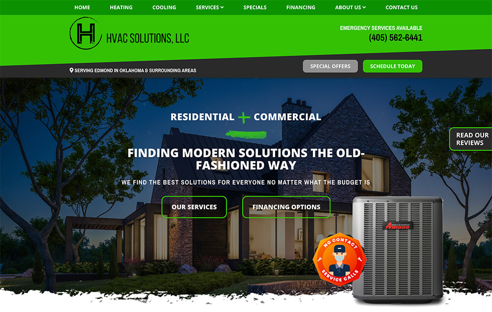
Conclusion: Use A Static Image with Call-to-Action Buttons
We highly recommend using a static image with a powerful and brief message containing one or two call-to-action buttons. The static image with these buttons is above the fold of the homepage, so it will be the first thing a user sees when they land on your website. You want the message to grab their attention. The buttons are another way to grab the attention of the user if they missed seeing the navigation.
We know the user is most likely landing on your website with a goal already. They need help navigating your website. Just having a navigation bar with links isn’t good enough. It is important that your website has several call-to-action buttons throughout the website, not just in the navigation or footer.
If you have a promotion that you need to highlight for a short period of time, there are other ways to promote it instead of highlighting it in the slider. You can add a top “alert banner” that will stay at the very top of your website with the message. Or, you can update the static image and call-to-action buttons to the promotion and revert it back to the original static image when the promotional period is over. Another option is to create a landing page that only highlights the promotion or special you are wanting to focus on.